Process
Step 1 – thumbnails
Every good painting begins with a plan! I had quite a clear idea of how I wanted Harry to look based off of my previous project, A Hermit Crab’s Guide to Rockpooling. But even so, I researched other illustrators such Alex Scheffler, and built my mood boards so I had an idea of themes and aesthetics.
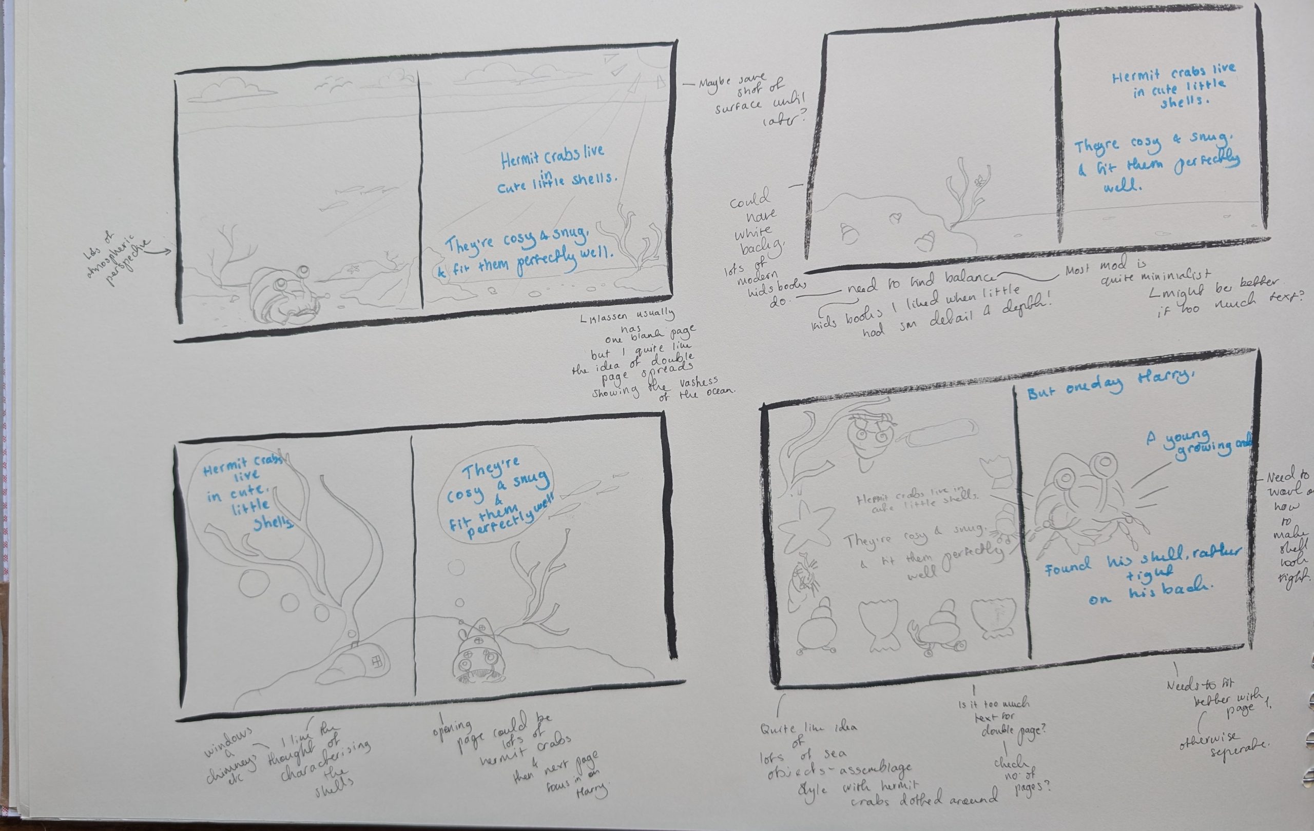
Then I began the thumbnails. I started some on paper if I had a lot of ideas to work through, and then when I settled on a design drew it digitally in Photoshop. After lots of back and forth with my tutor, i finalised the roughs and began adding colour.
This was then put into a handy little thumbnail book so I could see all the designs on paper.
Step 2 – Outlines
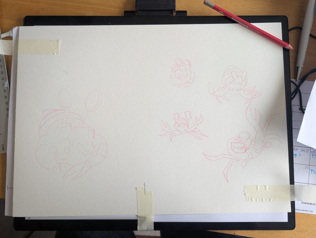
For the pages with a lot of detail I printed out the thumbnail and drew over it on my watercolour paper with a light box. I then stretched out this paper, let it dry, and applied masking fluid. This keeps certain areas clear, as the layer is peeled off, protecting the layer from any layers of paint that have already been applied. When it worked well (it often doesn’t) it can in fact be very satisfying.
Step 3 – Painting
For this project I worked with gouache paint, which allowed me to get some beautifully vivid colours. I also applied some details with a fine brush with watercolour, and in some places added some texture with watercolour pencil.
Step 4 – Digital
When I was happy with my paintings I scanned them in, often with difficulty as they were bigger than the scanning bed, and edited them in Photoshop. For some pages this could be just filtering the colours to make sure they are accurate to the original paintings. For others it could be adding highlights such as the whites of Harry’s eyes, or (being cheeky) and correcting any mistakes such as misaligned legs or paint splodges.
